
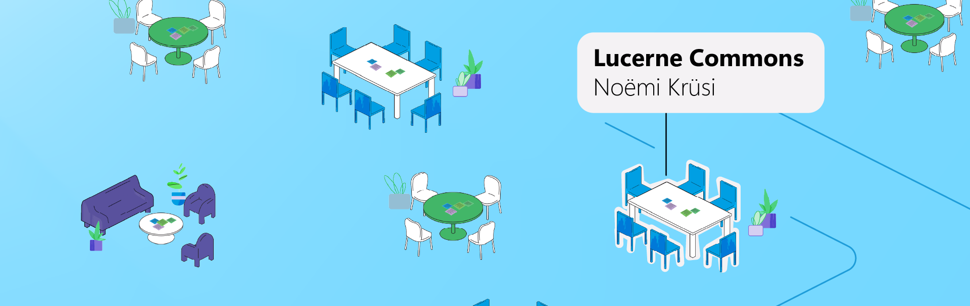
Currently, around 150 apprentices within the cantonal administration are spread across more than 75 different locations. This deep structural fragmentation makes genuine community building incredibly difficult. While established communication tools like MS Teams are highly optimized for formal workflows, they lack the affordances needed for a digital "Third Place"—a casual, low-barrier environment for informal exchange.
Lucerne Commons fills this gap by acting as a "digital commons". It deliberately balances spatial visibility with protected zones, fostering serendipitous encounters across different locations during the daily work routine of the apprentices.
This project was developed as an experimental prototype for my Master's thesis. While there are currently no concrete plans for an official implementation, I am highly open to sharing my research and insights with cantons, municipal governments, or other large, decentralized institutions that offer apprenticeships and are looking to enhance their community building
Prototype Walkthrough
The WebGL prototype was built to make the concept of the digital commons directly tangible in the browser, testing features like isometric theme tables, spatial audio, and selectable anonymity.
If you want to test it, let me know and I'll send you a link to the Demo. :)
The Science Behind the Design
The foundation of Lucerne Commons is deeply rooted in behavioral science and social psychology. Drawing from the Self-Determination Theory and the concept of Communities of Practice, the platform is engineered to foster intrinsic motivation by validating "legitimate peripheral participation"—meaning it is perfectly acceptable for apprentices to simply observe and lurk without the pressure to interact. By prioritizing Social Affordances over rigid task-based enterprise workflows, the environment cultivates a digital "Third Place" where psychological safety thrives and the fear of institutional surveillance is actively mitigated.
Design & UX Highlights
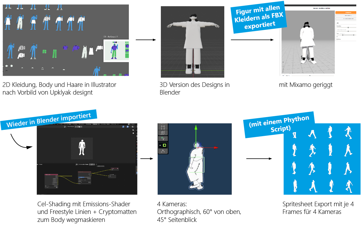
The 2D-to-3D-to-2D Pipeline
To bridge the gap between the canton's flat vector illustrations and a spatial world, all characters and assets were modeled in 3D (Blender), stylized with cel-shading, and exported via Python scripts as 2D spritesheets. This complex pipeline maintained a vibrant, flat aesthetic within a functional 2.5D WebGL environment.
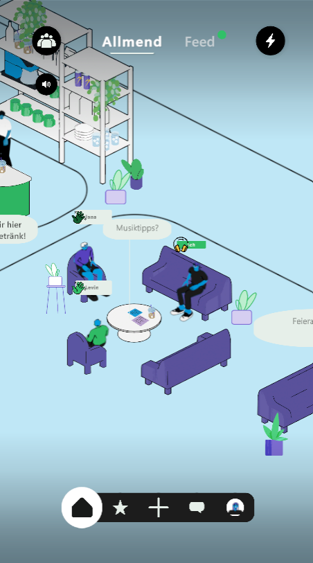
Fostering Serendipity via Spatial UI
To foster serendipity and lower the threshold for engagement, the spatial UI moves away from traditional, search-heavy tools by prioritizing observation over immediate action. Apprentices navigate an isometric cafeteria where they can "read the room" before actively participating. This is achieved through rich visual cues: peers are rendered as tangible avatars with visible status and off-screen indicators, accumulating post-it notes on tables signal asynchronous messages, and animated speech bubbles highlight live activity. Together, these elements translate the "commons" metaphor into a highly readable digital space.
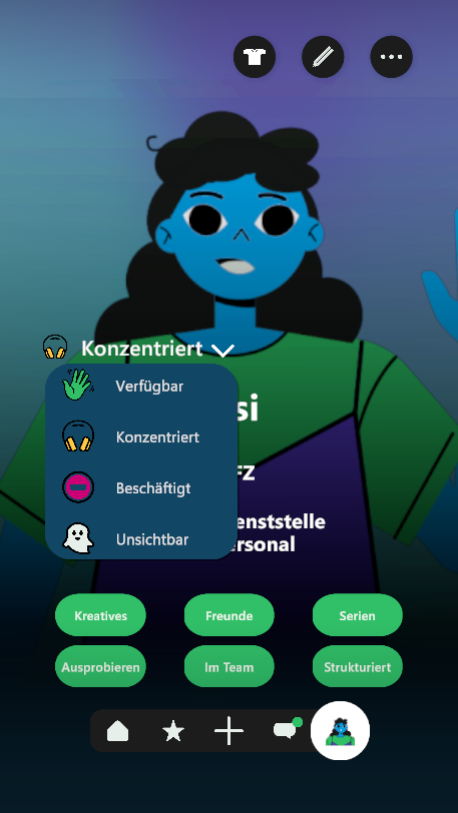
Avatar Customization & Psychological Safety
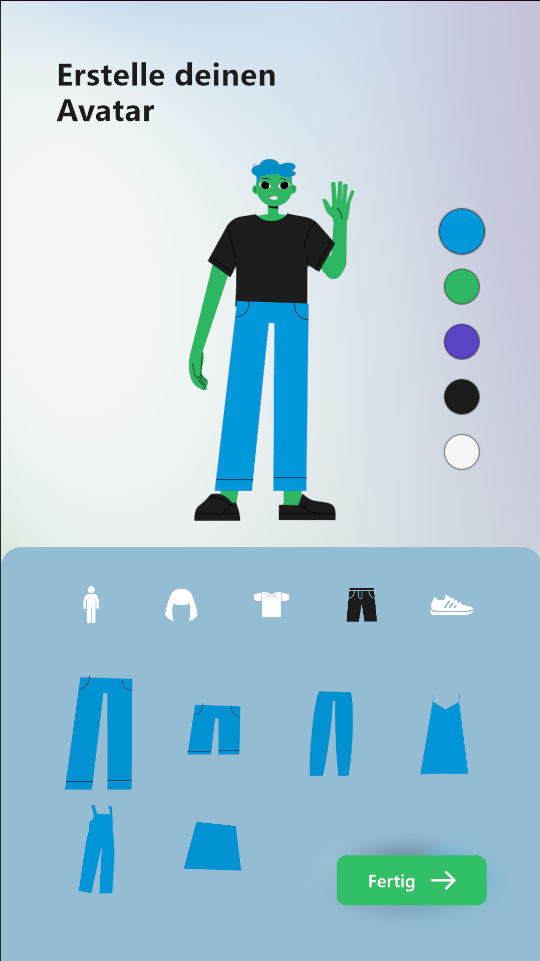
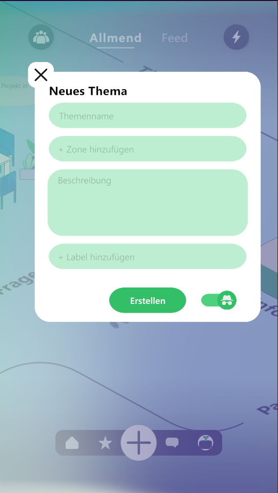
A "paper-doll" avatar builder grants apprentices autonomy over their digital identity. To mitigate the fear of asking "stupid questions," the design incorporates a situational "incognito mode," allowing users to participate safely without exposing their identity to the wider administration.
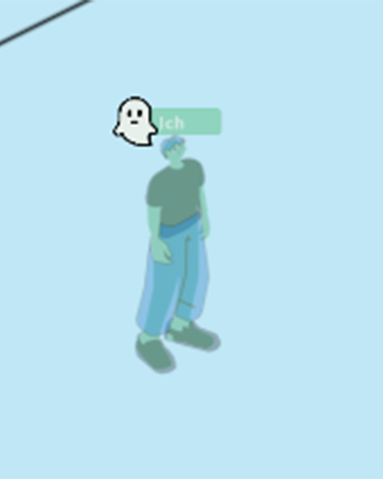
Dynamic Ambient Awareness: To organically connect the digital space with the apprentices' real-world routine, a dynamic lighting system mimics the actual sun's position from 07:00 to 20:00, subconsciously anchoring the virtual environment in shared time.
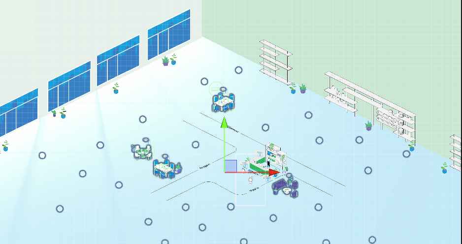
Overview of the Cafeteria and the table spawn points.
The Process: A Human-Centered Approach
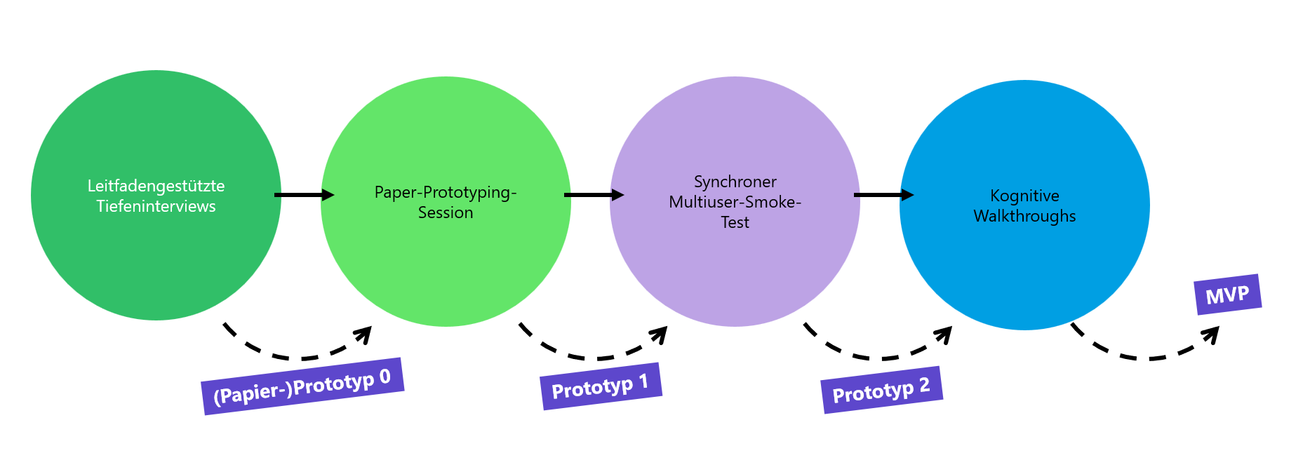
To ensure the platform addressed genuine user realities, the project followed tmethodology:
In-Depth Interviews: Exploratory sessions uncovered hidden barriers—such as the fear of disturbing colleagues and latent surveillance pressure—revealing the specific needs for a safe, informal digital space.
Paper Prototyping: Participatory co-design sessions translated these psychological needs into early spatial metaphors and tangible interface structures.
Iterative Testing: The WebGL prototype underwent synchronous multi-user smoke tests and individual cognitive walkthroughs (using the Think-Aloud method) to evaluate both technical resilience and "Perceived Social Affordance".
By cross-referencing interview transcripts, co-design observations, and screen recordings, the research achieved robust triangulation. This ensured that every UX decision was empirically backed by diverse user behaviors rather than isolated assumptions.
Wireframing
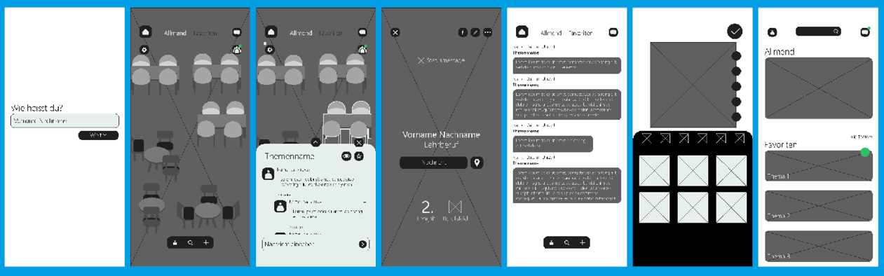
Above: Wireframes used for the paper-prototyping session. Below: The final wireframes with a clear grid to achieve consistency in Unity.
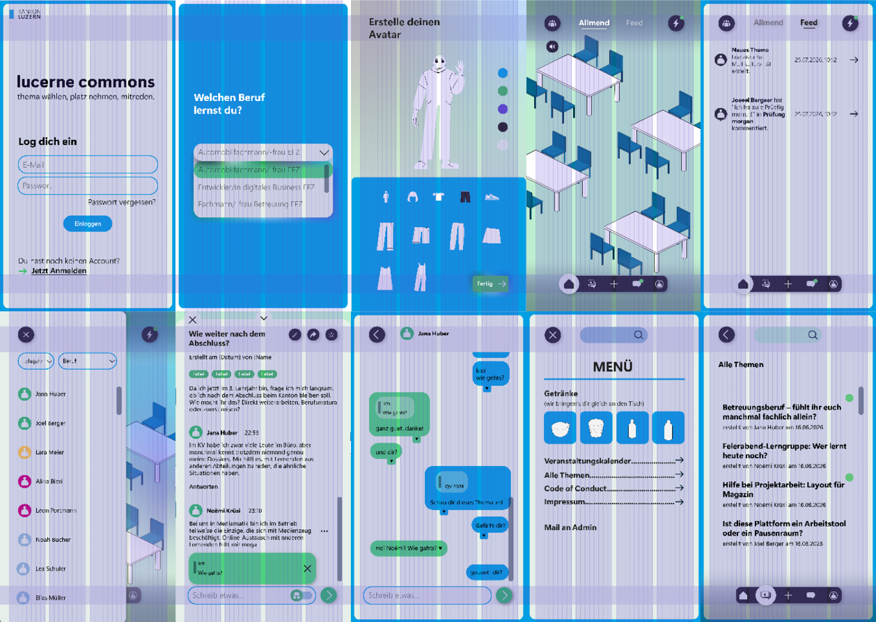
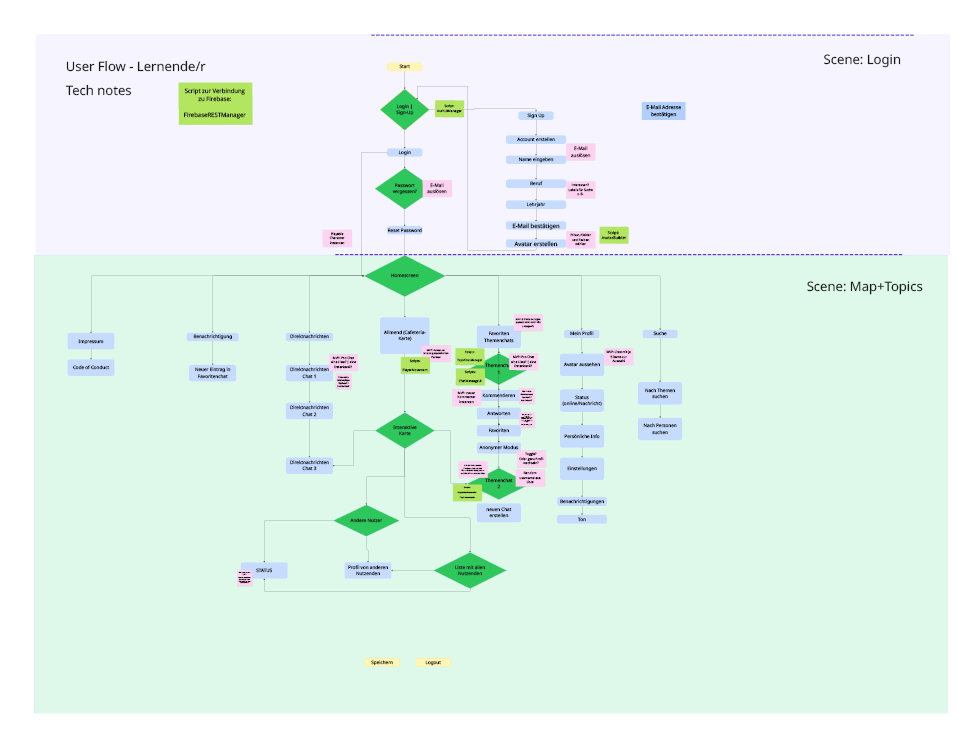
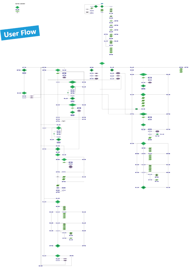
I went from User Flow 1 (left) to User Flow 2 (right). The the first user flow helped me plan the scripts and prepare the wireframes for the prototyping session. The second user flow was made with the data and insights collected in the testing. As you can see, it grew a lot more complex als the project progressed.
Want to read more?
If you are interested in the full Master's thesis or the detailed technical documentation, feel free to reach out to me directly! I am happy to share the documents upon request.
Credits
Tech Stack & Prototyping: Unity WebGL, Blender, Mixamo, Adobe Creative Cloud (Illustrator, Photoshop, InDesign), Google Firebase, Hostpoint.
Visual Assets: Vector illustrations based on @upklyak (Freepik/Magnifik).
Audio: Music by @mirostar (Pixabay), sound effects via freesound.org and Adobe Stock.
Typography: Segoe UI, Segoe UI Variable Display.


